“In The Presence of Painting”
"In the Presence of Painting"
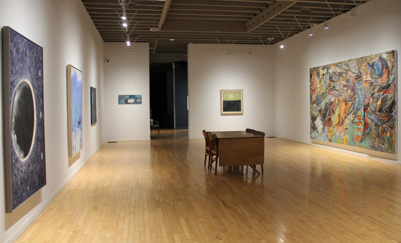
Gallery Installation View
"In the Presence of Painting"
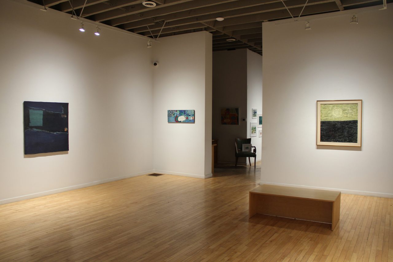
Gallery Installation View
"In the Presence of Painting"
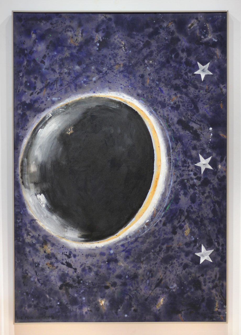
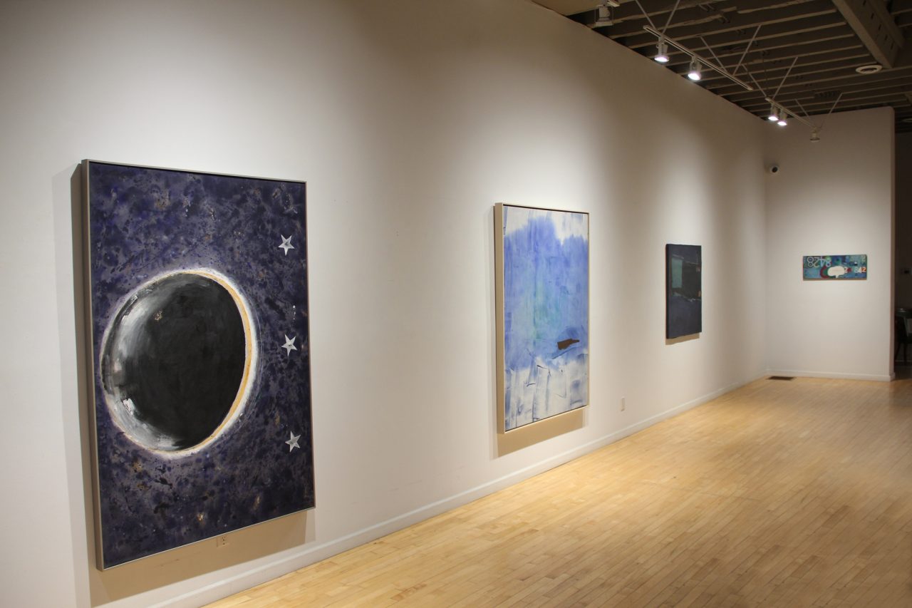
Gathie Falk “The Moon and 3 Stars”, 2004
"In the Presence of Painting"
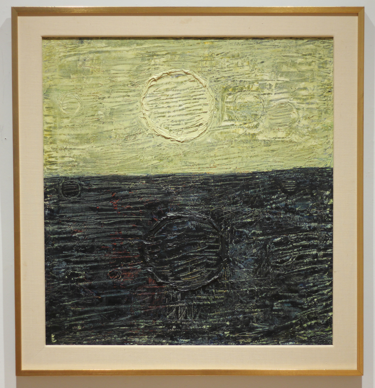
Paterson Ewen “Untitled”, 1962
"In the Presence of Painting"
Gallery Installation View
"In the Presence of Painting"
Gallery Installation View
"In the Presence of Painting"
William Perehudoff “AC-79-F”, 1979

"In the Presence of Painting"
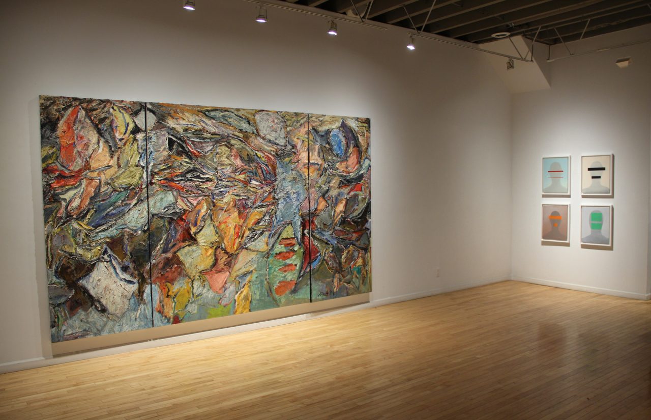
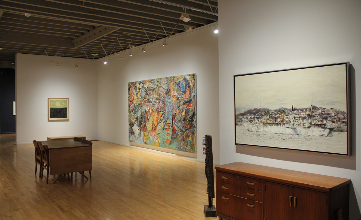
Harold Klunder “Antwerp Blue (Altarpiece)”, 1980-1982
"In the Presence of Painting"
Gallery Installation View
"In the Presence of Painting"
Gallery Installation View

"In the Presence of Painting"
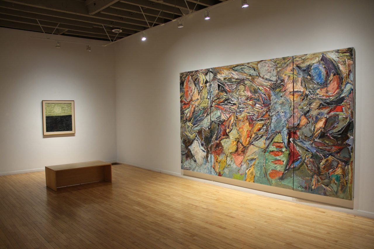
Michael Snow “La Boca (Cubaism)”, 1958
"In the Presence of Painting"
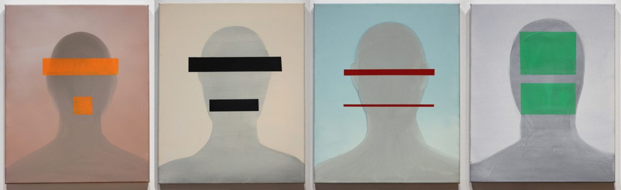
Wanda Koop “Green Zone (Heads)”, 2004
"In the Presence of Painting"
Gallery Installation View
"In the Presence of Painting"
Gallery Installation View
"In the Presence of Painting"
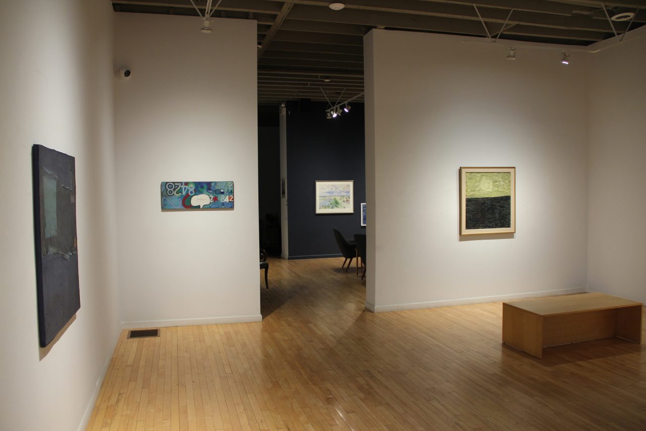
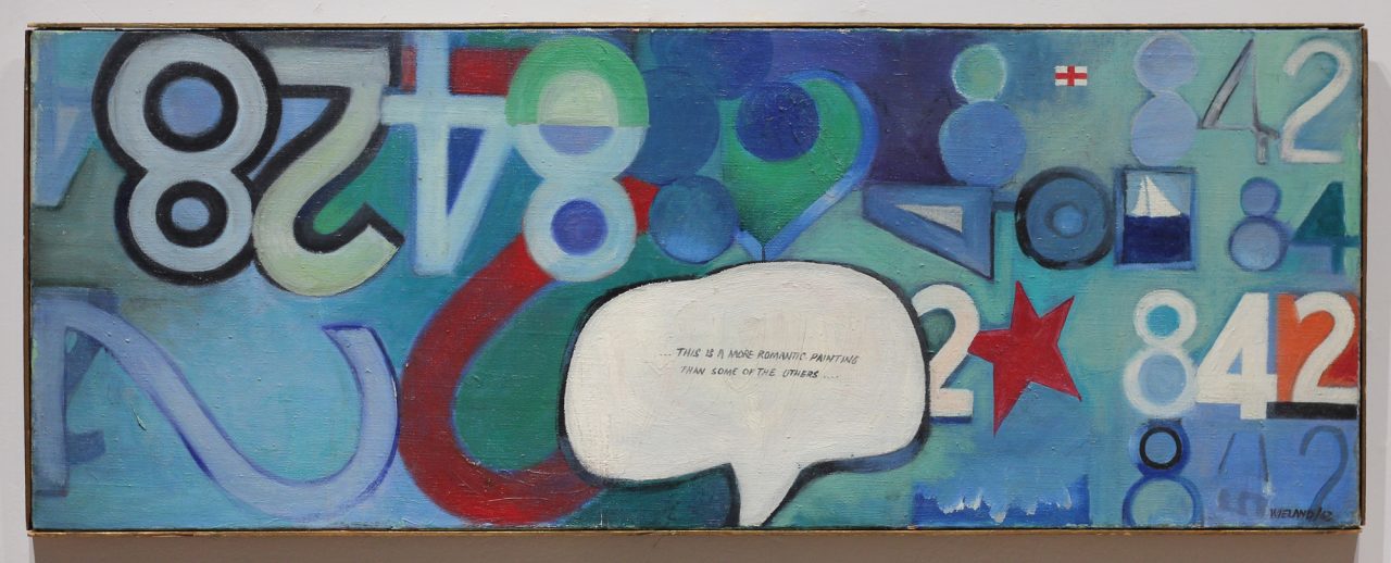
Joyce Wieland “Numbers”, 1963
"In the Presence of Painting"
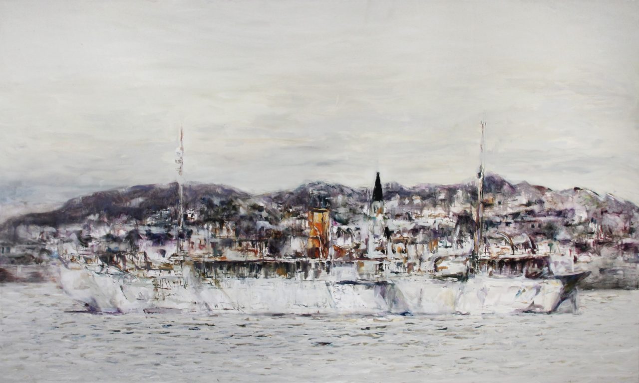
Roly Fenwick “Harbour Grace”, 2016
“In The Presence of Painting” December 4, 2025 – January 31, 2026
Painting and all of its pleasures is the focus of our current exhibition. Proclaimed “dead” multiple times over the past 150 years, we celebrate the materiality of paint and its lasting impact. From sensuous to refined, gestured to detailed, experiential to organic, we honour painting and its transformative alchemy. Specifically, we have selected paintings created early in each of the artist’s formative years.
The centrepiece of the exhibit is Harold Klunder‘s 12-foot triptych “Antwerp Blue (Altarpiece)” from 1980-1982. Considered one of Canada’s greatest painters, to be in the presence of this triptych is all encompassing. The layered world that Klunder presents through heavily built-up and rich pigments, hints at figuration, landscape with nods to religious iconography. It has been said that Harold Klunder makes paintings “the way life is lived; everything goes in and everything must be considered”. This painting is a testament to that statement, an altarpiece to Klunder’s love of the medium.
Hanging next to Harold Klunder is an early 1962 Paterson Ewen abstract, painted while living in Montreal. In the early 1960s Ewen’s paintings explored the relationship of shape and texture, vigorously worked with a knife. With the “Untitled” paintings in 1962 he implies a landscape format with a horizon line and contrasting colours that suggest land and sky. Here, Ewen clearly articulates sculptural ridges of impasto in both linear and circular form, a signal toward his interest in celestial subjects.
Wanda Koop‘s ethereal “Green Zone” portraits hang in a grid on the opposite side of the Klunder. Painted in Koop’s unmistakable refined way, the four heads are silhouetted with abstract colour bars acting as eyes and mouths. Through (seemingly) simple line and powerful colours, Koop explores the impact of technology on humanity and the transmission of information in a modern age.
On the opposite wall, we have hung in progression, three paintings that can be interpreted as abstracted versions of the landscape.
Gathie Falk‘s 2005 “Heavenly Bodies: The Moon & 3 Stars” painting celebrates the wonder of the night sky. Selecting elements of the night sky that Falk finds interesting, she stylizes, on purpose, the moon and stars. Set on a gorgeously painted ground, the five-pointed stars sparkle and the moon orbits around Falk’s fantastical heavens.
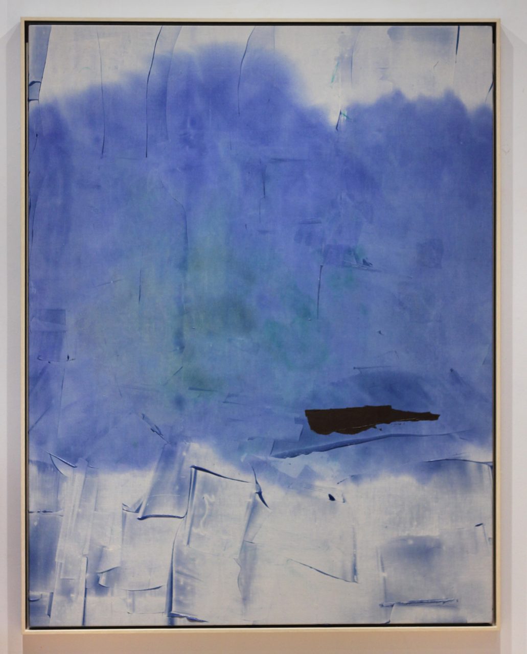
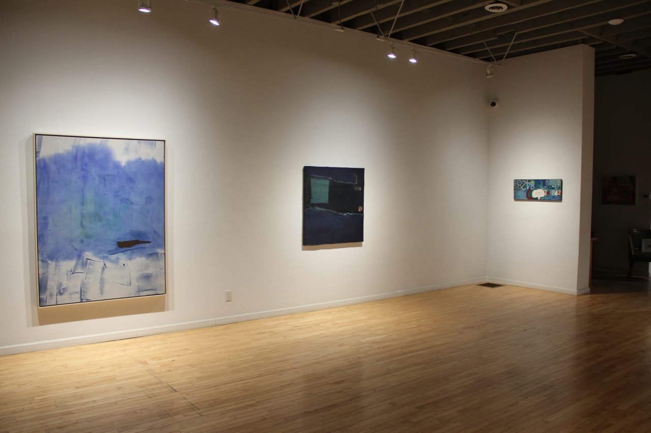
William Perehudoff‘s abstract paintings were always concerned with colour harmony and the exploration of material. “AC-79-F” from 1979 is both spontaneous and playful, made to look uncalculated in its rich complexity. Luscious paint is brushed on and feathered, scraped on and off, creating a compelling push and pull, an atmospheric surface that evokes feelings of the sky, but is rooted in pure Modernist abstraction.
Completed in May 1958, the abstraction of Michael Snow‘s “La Boca (Cubaism)” consists of rough rectangles of varying sizes embedded in thickly painted grounds. Concerned more with the surface and how colours interact, Snow’s abstraction at the time focused purely on the formal qualities. Simple in structure, the painting consists of a few limited elements and focuses our attention on the balance of rich colours, the division of space and the seductive application of paint. The painting was titled after a trip that Snow and Wieland took to La Boca, Cuba in early 1958, showing off Snow’s cheeky sense of humour.
Also painted early in her career is Joyce Wieland‘s 1963 “Numbers”. Living in a loft at 191 Greenwich Street in NYC amongst the excitement of the Battery neighbourhood of Manhattan, Wieland absorbed the excitement of the city into her paintings. Typically small in scale, the paintings of 1963 are structured with grids or film frames and reflect her surrounding neighbourhood and life. Speech balloons, legitimized through the Pop movement, are often left empty, or in this case, contain a quote by then husband Michael Snow. Hearts, stars, sailboats (seen in the nearby Hudson River) are re-used symbols as well as Wieland’s interest in numbers.
Completing the exhibition is Roly Fenwick‘s evocative, shapeshifting painting “Harbour Grace”. Growing up in Owen Sound, ON, Fenwick was reminded of the familiar image of old ships docked off the shore on a recent visit to Harbour Grace, NFLD. The foggy mist is palpable in this painting where the boat is one with both the water and the town beyond. The season is indecipherable, but looks icy cold. Fenwick was inspired by not only the rusty boat, but also of the “place that may compel wonder or moments of memories. A tyranny of places that though you think you have left them, you still inhabit them.”