“Chroma IV”
"Chroma IV"
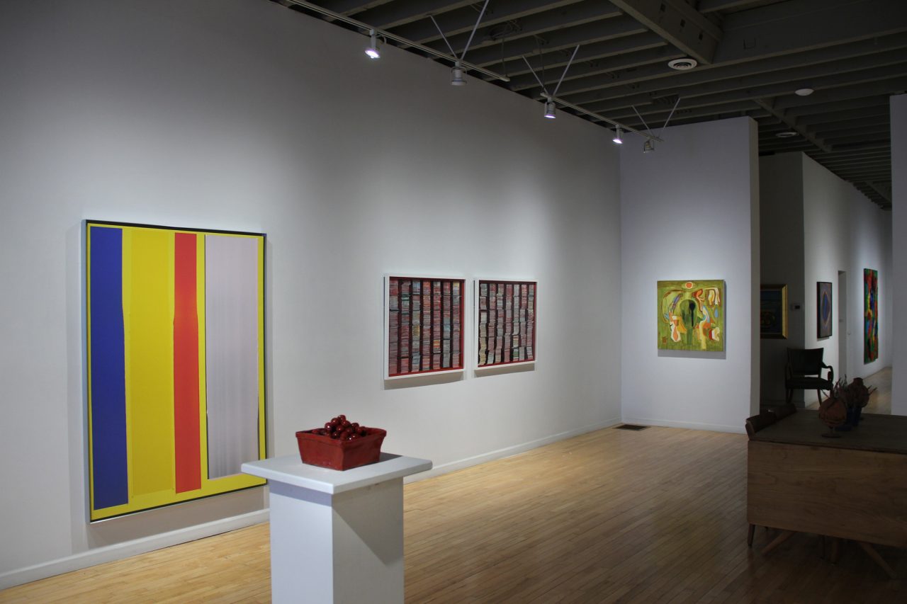
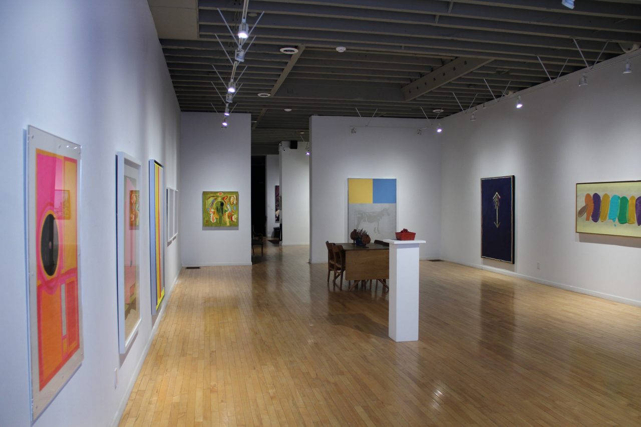
Gallery Installation View
"Chroma IV"
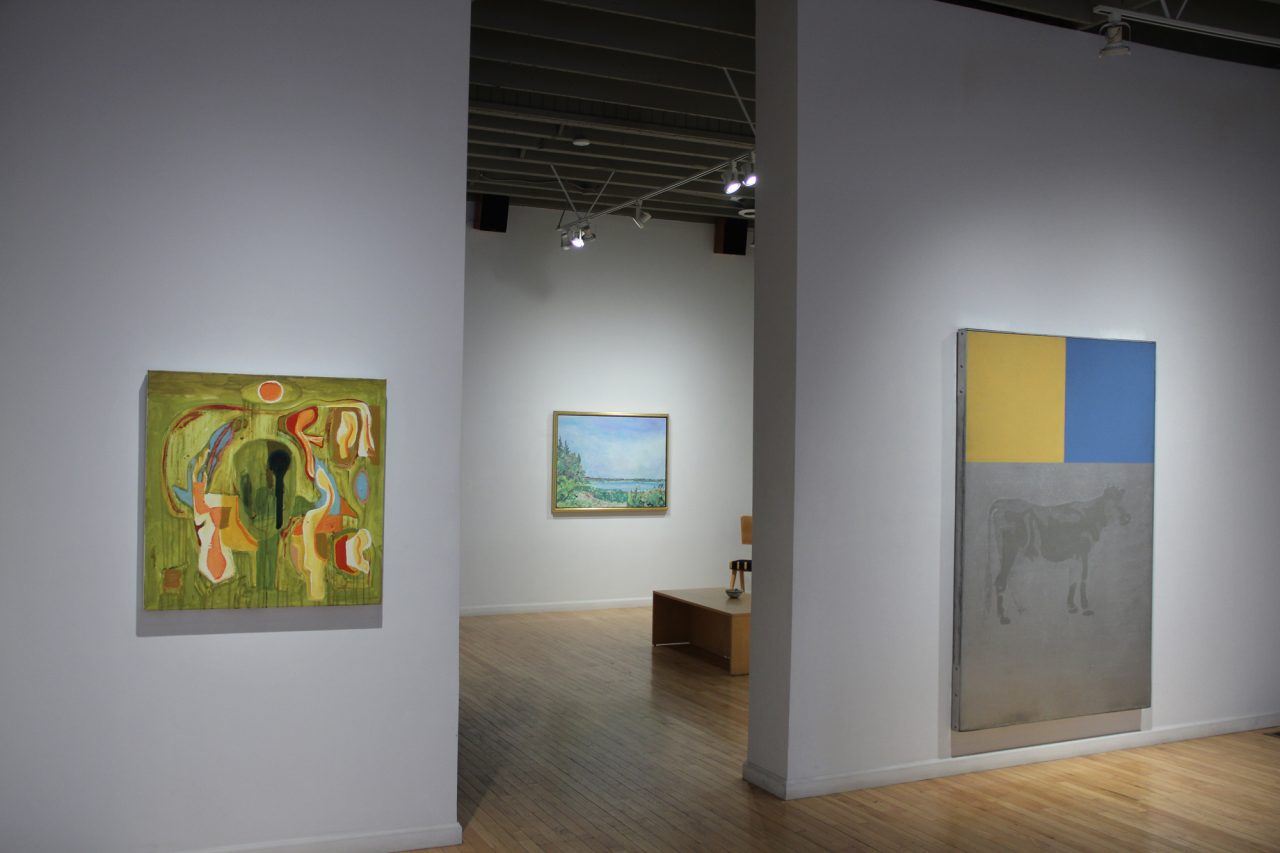
Gallery Installation View
"Chroma IV"
Gallery Installation View
"Chroma IV"
Gallery Installation View
"Chroma IV"
David Bolduc “Spider”, 1976
"Chroma IV"
Gathie Falk “Cherry Basket”, c. 1969
"Chroma IV"
Mark Dicey “2631-II-21”, 2021
"Chroma IV"
Greg Curnoe “Woo Loong Tea”, c. 1962
"Chroma IV"
Gallery Installation View
"Chroma IV"
Gallery Installation View
"Chroma IV"
Gallery Installation View
"Chroma IV"
Gallery Installation View
"Chroma IV"
William Perehudoff “AC-83-049”, 1983
"Chroma IV"
William Perehudoff “AC-90-003”, 1990
"Chroma IV"
Dorothy Knowles “Murray Point in the Morning”, 1993
"Chroma IV"
Hans Wendt “Super Nasum Aspicientis”, 2018
"Chroma IV"
Gallery Installation View
"Chroma IV"
Gallery Installation View
"Chroma IV"
Gallery Installation View
"Chroma IV"
Gallery Installation View
"Chroma IV"
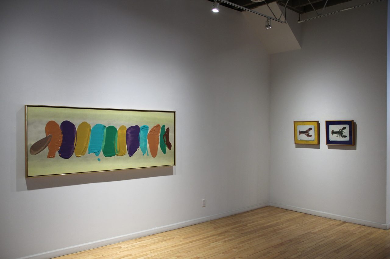
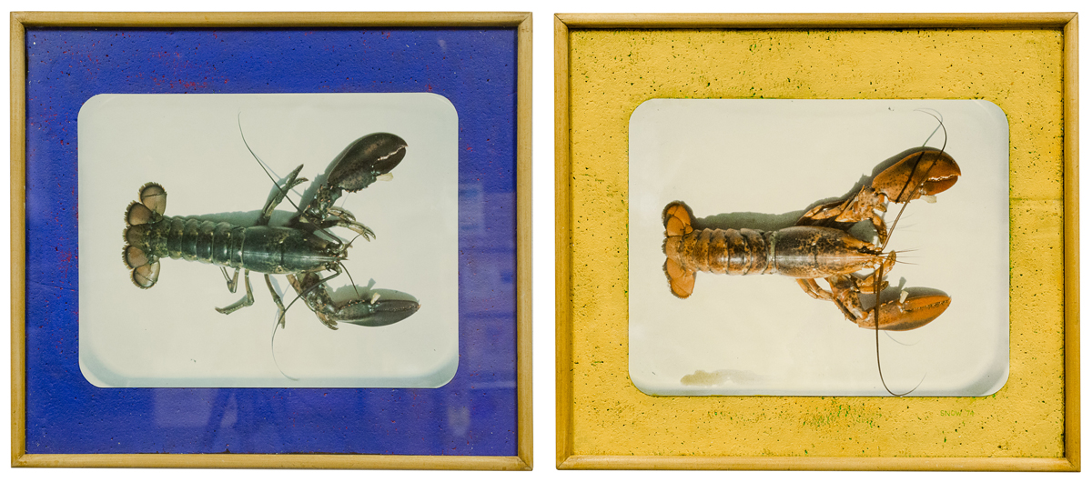
Michael Snow “Lobster”, 1974
"Chroma IV"
Susan Dobson “Karsh, Lake, Letendre”, 2017
"Chroma IV"
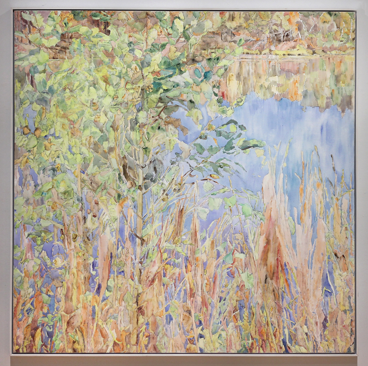
Dorothy Knowles “York Pond”, 1994
"Chroma IV"
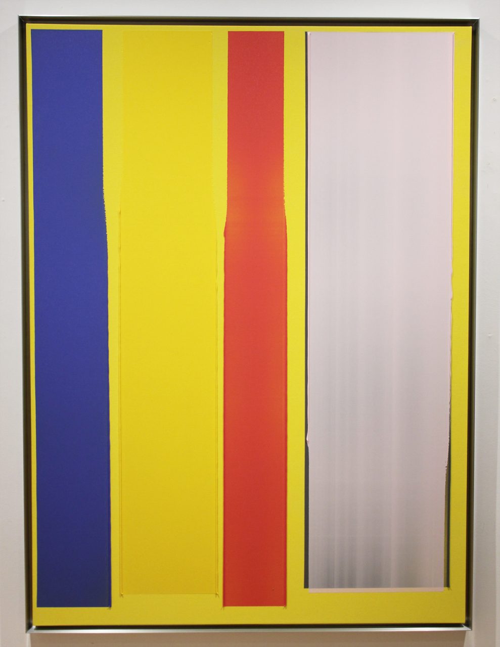
Jonathan Forrest “Yellow Submarine”, 2020
"Chroma IV"
Gallery Installation View
"Chroma IV"
Gallery Installation View
"Chroma IV"
Gallery Installation View
"Chroma IV"
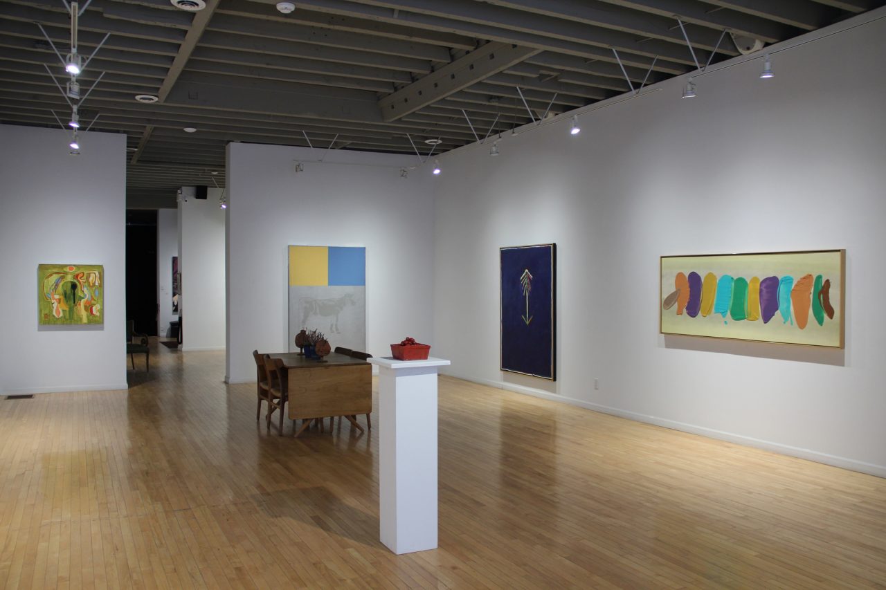
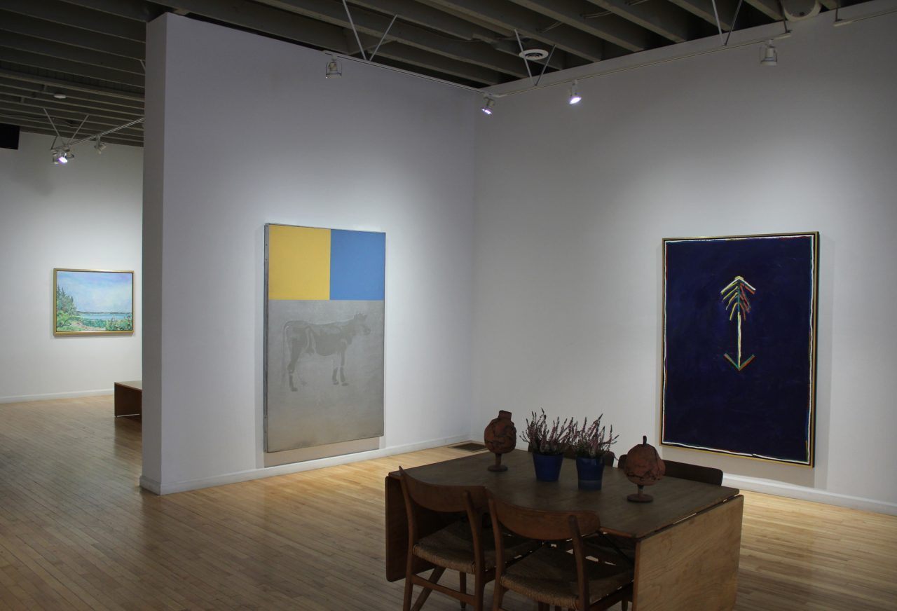
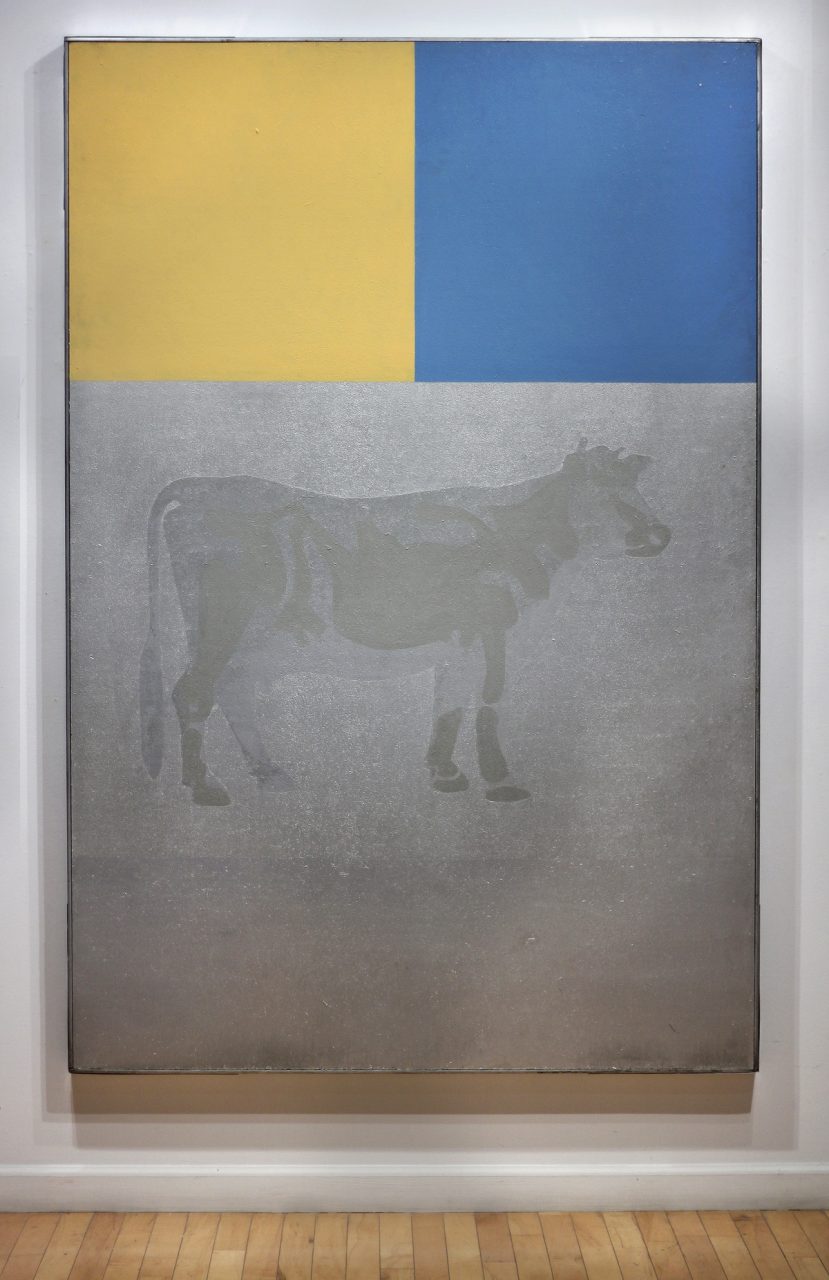
Jack Chambers “Cow”, 1966-67
"Chroma IV"
Harold Klunder “A Child is Conceived”, 2004
"Chroma IV"
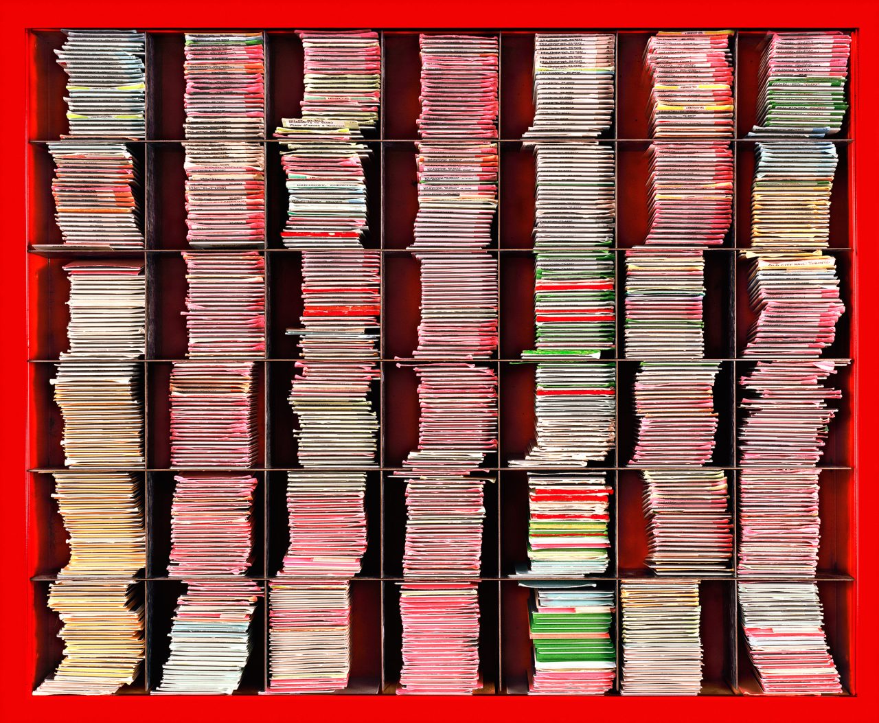
Susan Dobson “Burtynsky, Carr, Colville”, 2017
"Chroma IV"
Dorothy Knowles “Summerfallow”, 1986
“Chroma IV” — January 8 – February 12, 2022
For the past three years we have curated exhibitions deep in the winter months that feature colour. Continuing the tradition, this year, we have selected artwork that celebrates, compares and contrasts the quality of a colour’s purity, intensity or saturation with an emphasis on the impact of light.
Artworks by the following artists are included: David Bolduc, Jack Chambers, Greg Curnoe, Mark Dicey, Susan Dobson, Gathie Falk, Jonathan Forrest, Harold Klunder, William Perehudoff, Michael Snow and Hans Wendt.
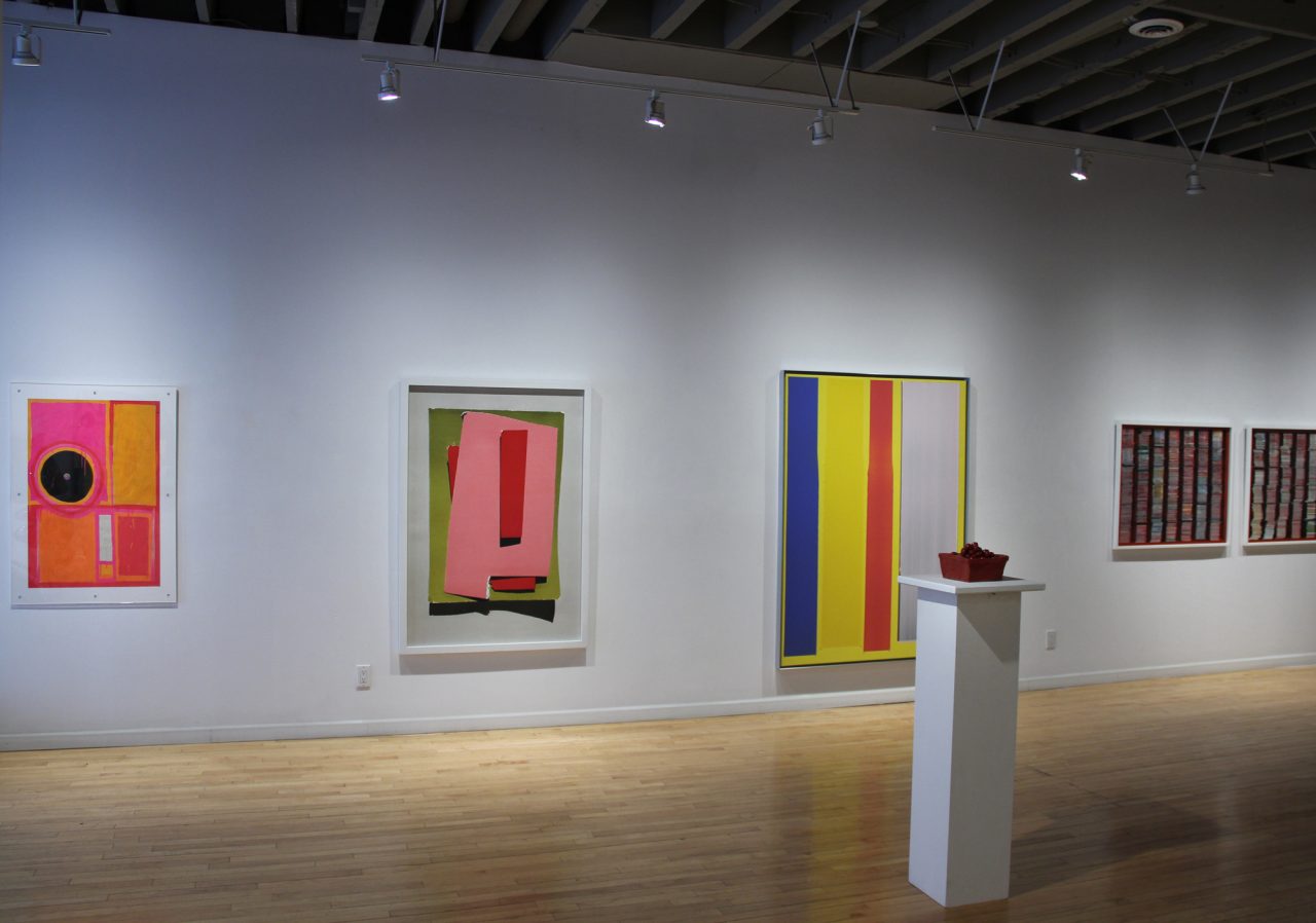
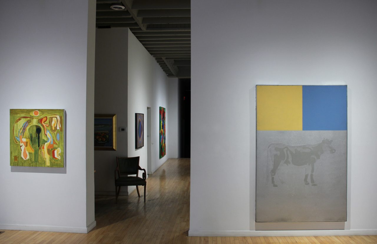
The exhibition began with Jack Chambers‘ 1966-67 silver painting “Cow”. An exploration of the antithesis of pure colour, “Cow” is Jack’s study in painting light. Composed like a film strip with the colour bars at the top and a silver bar at the bottom, the image reflects and refracts light, shifting as you move around the cow. The primary colour palette of yellow and blue is precise and intentional. Perhaps a subtle nod to nature or perhaps Jack’s way of pairing things down to their simplest forms.
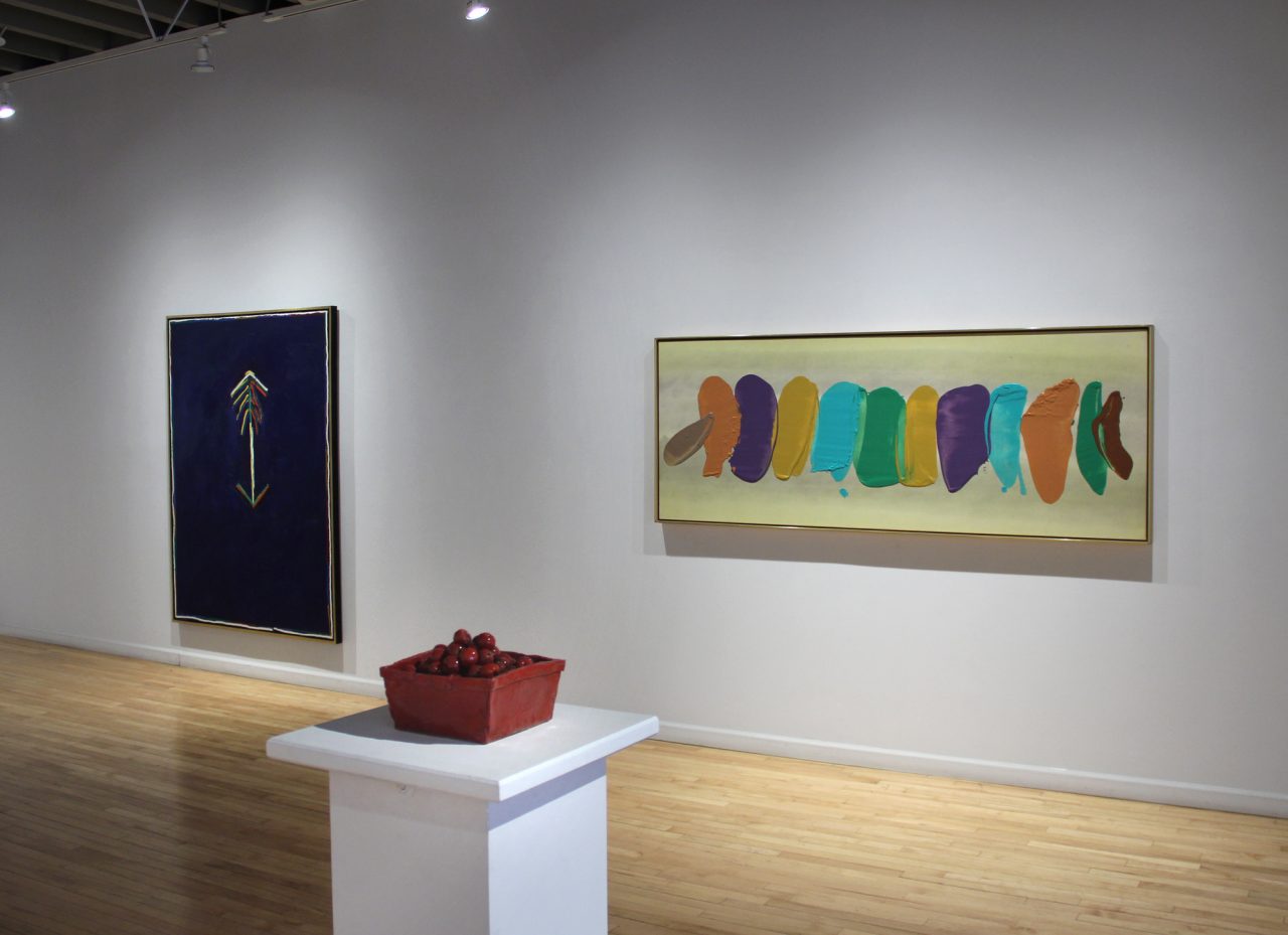
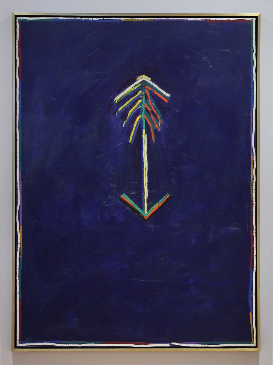
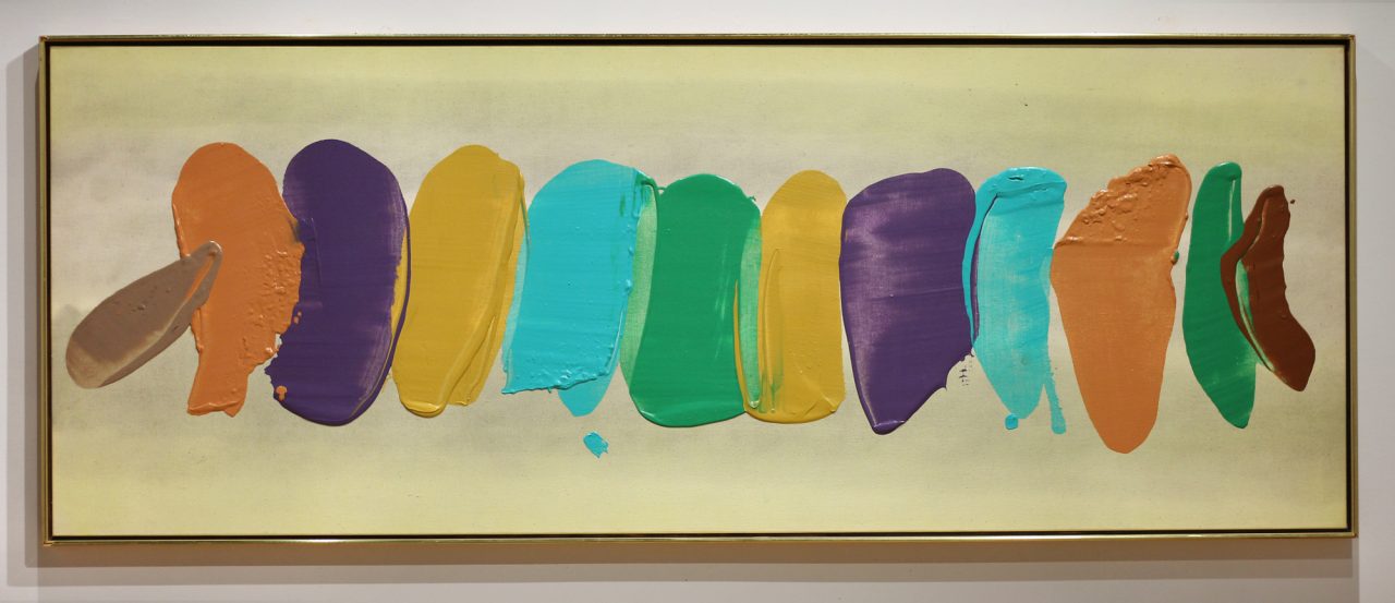
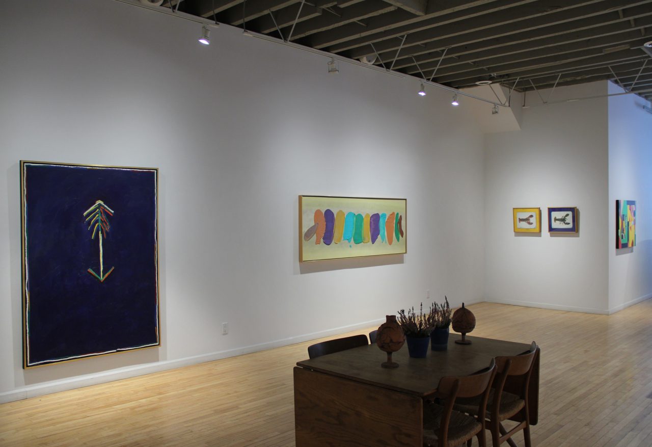
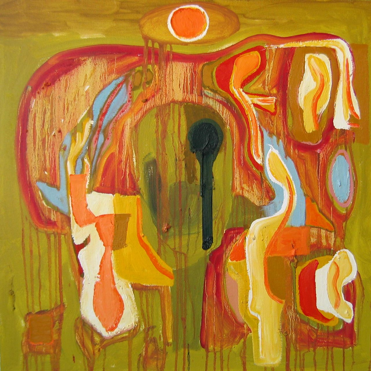
Where Jack Chambers’ “Cow” is void of colour, David Bolduc‘s 1976 “Spider” is rich and sumptuous. Best known for his colourful abstract paintings that focused on a central linear image painted over a wide variety of textured coloured backgrounds, Bolduc used unmixed colour straight from the tube to draw his controlled lines. “Spider” has the perfect balance of both: a velvety blue background contrasted with the vibrant central figure, double edged with white for impact.
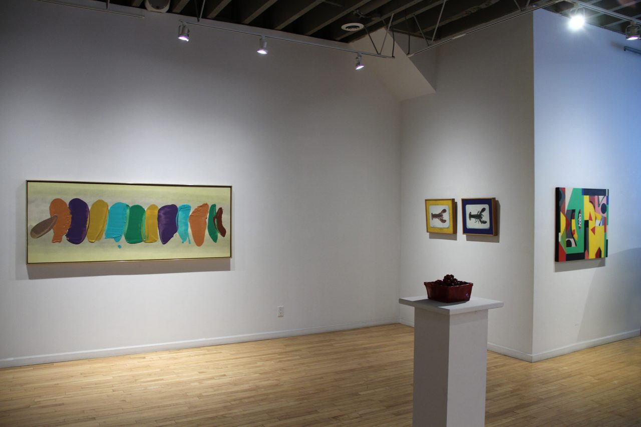
We have included two new-to-the-gallery William Perehudoff colour-field paintings in our show. With glowing colour and subtle, nuanced grounds, Perehudoff’s paintings have emotional resonance. Using a wide palette, Perehudoff’s mastery was the way he communicated emotion through colour. The bright gel-like marks skip across the buttery yellow background in “AC-83-049”, while in the darker “AC-90-003”, the smoky background glows against the broad, confident blue, green and purple brushstrokes.
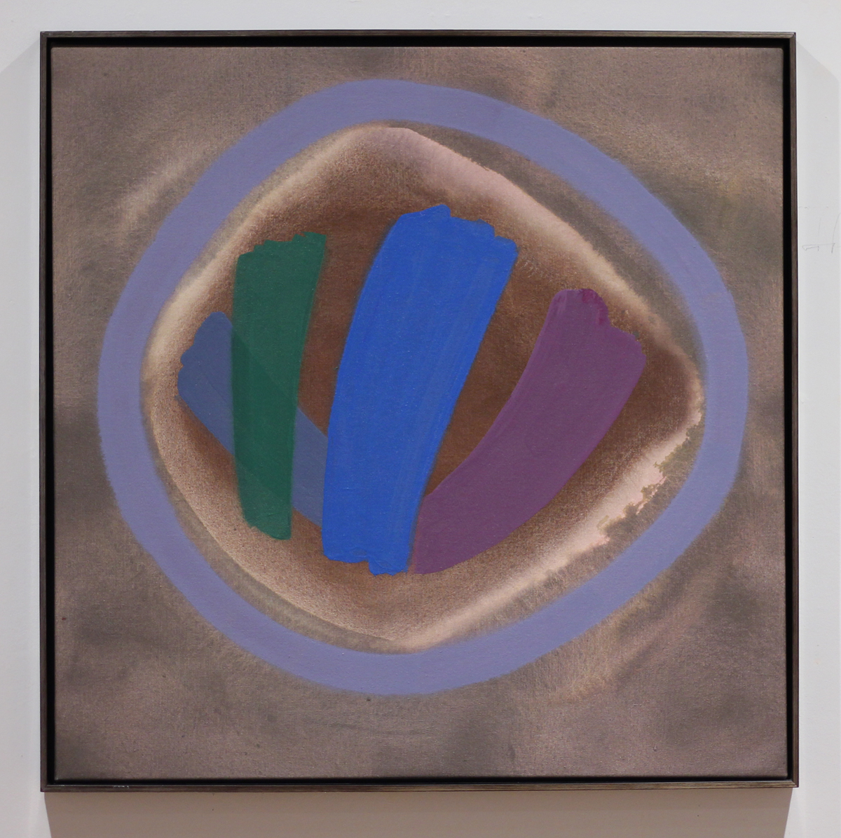
Both Jonathan Forrest and Hans Wendt‘s paintings follow similar Modernist parameters as Perehudoff. By dragging, pulling and scraping paint across the canvas, Forrest creates thin layers of colour, shapes and textures on his brightly coloured backgrounds. He creates a luscious painterly experience that is indebted to his knowledge of colour theory and play of light. Similarly, Hans Wendt has a deep understanding of colour theory and plays with the concept by literally taking paint samples used by art students to create his trompe-l’oeil still life paintings. Dramatically lit and carefully composed, the resulting watercolours are dramatic studies of colour and celebrations of minimalist abstraction and watercolour techniques.
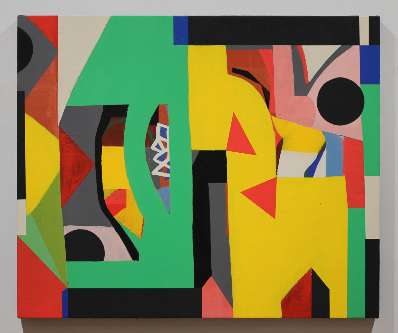
Also a student of the history of abstraction, Mark Dicey uses his knowledge of painting and the history of painting as the starting off point for the recent abstract included in our show. Shape, colour, line and surface are all brought together through the interactive painting process, where Dicey responds to the free flowing shapes and colours, layering both geometric and organic elements into a cohesive whole.
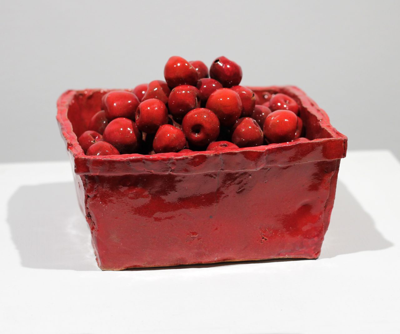
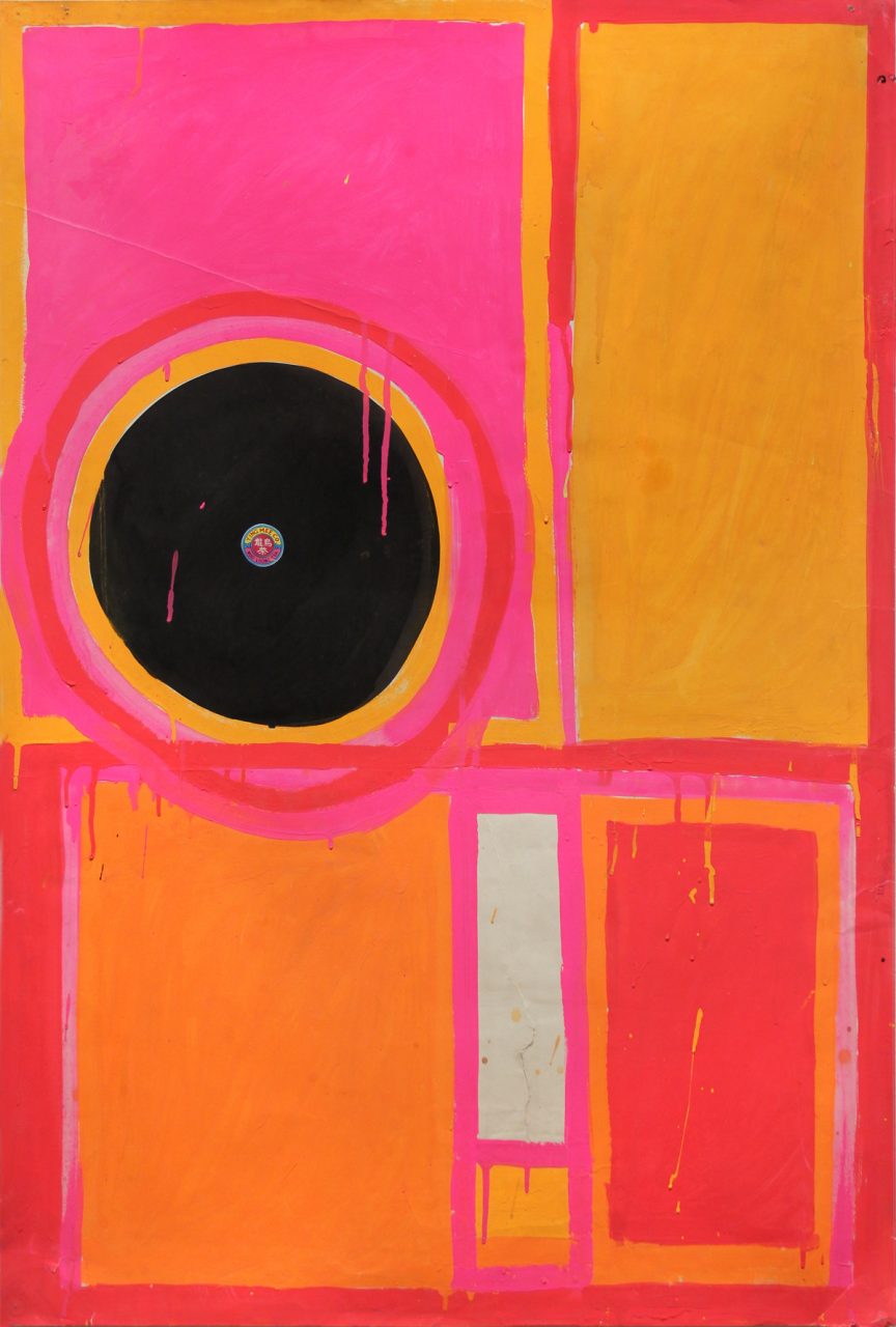
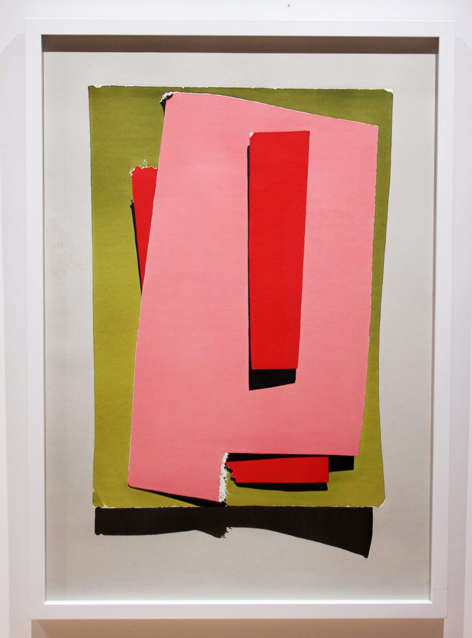
Greg Curnoe, one of Canada’s greatest colourists, shows us in “Woo Loong Tea” how much he understood colour. Using gouache and day glo paint in contrasting orange and pink colours, this early 1960s work on paper is as fresh as the day that it was made. Gathie Falk also understands the power and impact of colour. In her rare 1969 “Cherry Basket”, Gathie creates a juicy sculpture of a basket of cherries, clearly hand made and carefully sculpted out of clay.
Michael Snow uses colour to emphasize the meaning of his “Lobster” photographic diptych. Here, we are presented with a lobster in both its un-cooked and cooked state; the left panel a blue or raw lobster, contrasted with the red, cooked lobster on the right. Snow has further enhanced our understanding of each lobster by painting the styrofoam that each lobster is laying on. We encounter blue, red and yellow, the 3 primary colours. Contrasts and opposites, a duality or double-sidedness that the lobsters now represent.
Harold Klunder is known for his deeply personal lush abstract paintings which have figurative elements. Using a thick empasto, Klunder layers non-conventional colours and patterns to create his intricate and expressive paintings. Poetic in sensibility, his paintings are compelling and uniquely his own.
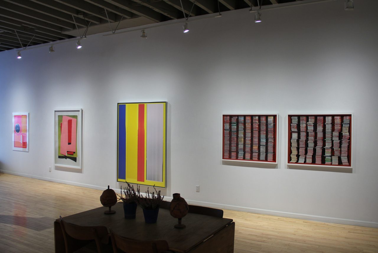
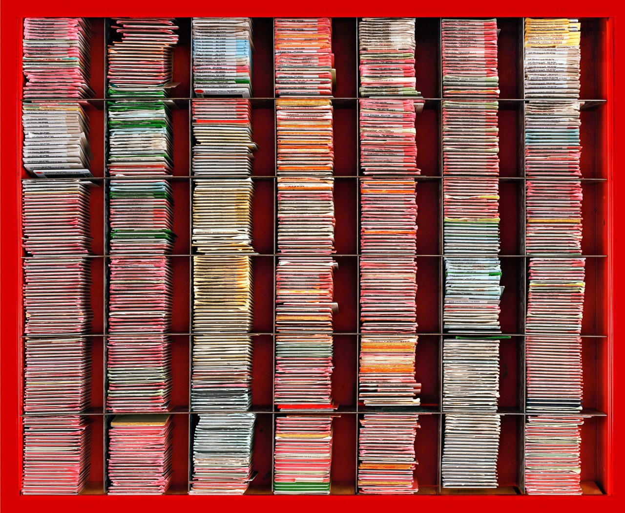
Though not originally intended to explore colour, Susan Dobson‘s slide cabinet photographs unintentionally bring into focus the hierarchy of art historical study. The two photographs document the University of Guelph’s Canadian art slide collection. Stored in a Canadian Tire red metal tool cabinets, the slides are labelled based on the medium of each artwork captured on the slide (blue = sculpture, pink = painting, yellow = architecture). Though we cannot see the slides, we understand what they represent by the colours that they project.
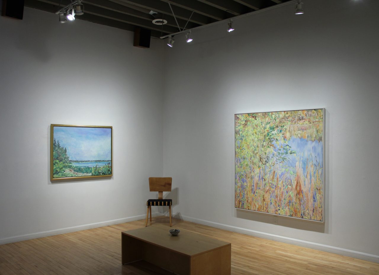
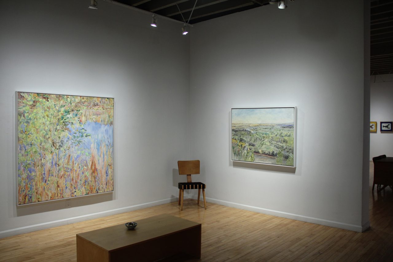
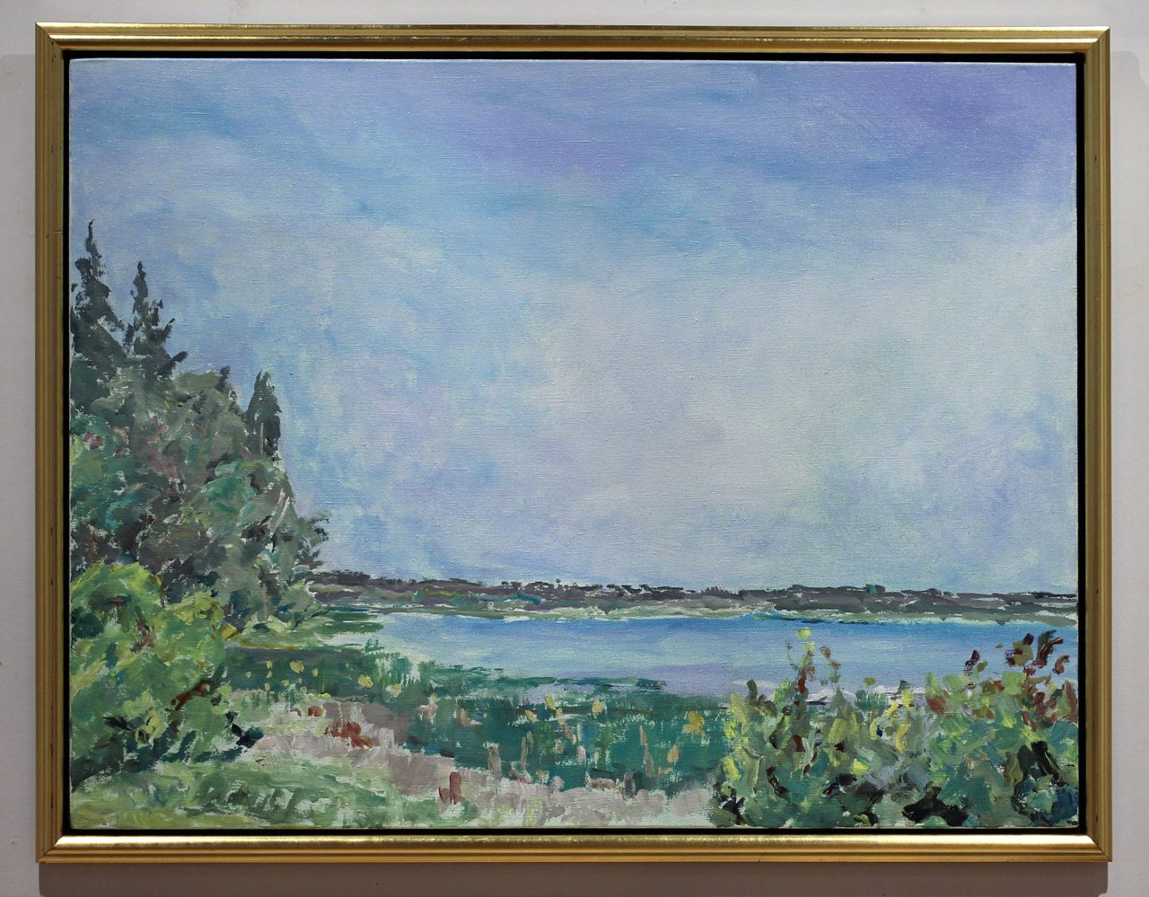
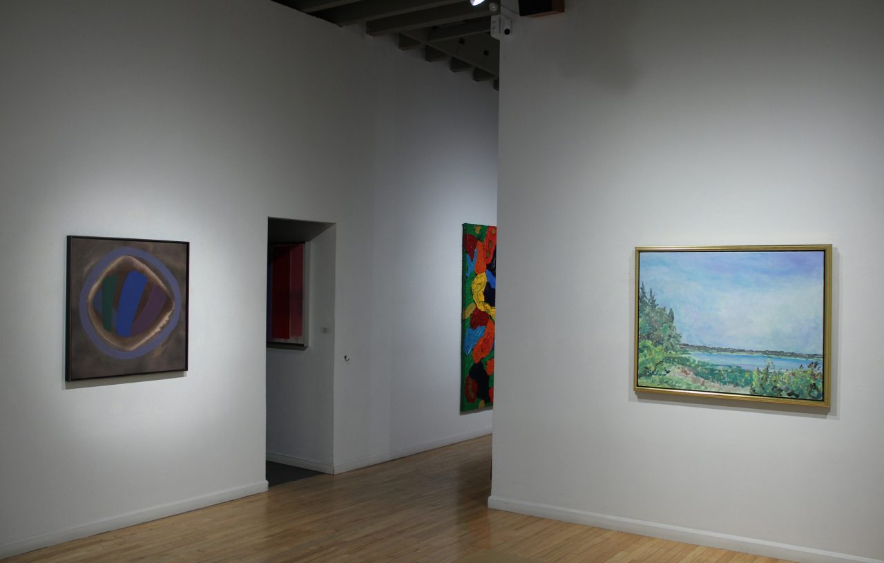
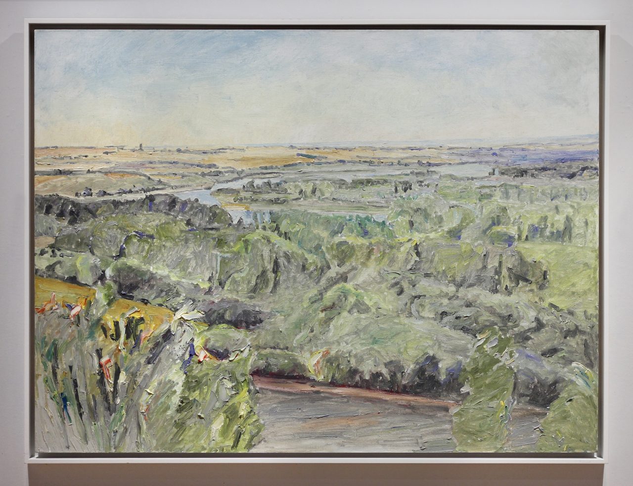
Finally, in contrast to the colour in the front gallery, we have hung recent landscapes by Dorothy Knowles in our middle gallery. We relish in her elegant prairie landscapes that capture the lightness of the atmosphere and the dappling of summer’s intensity.