“Chroma V”
"Chroma V"
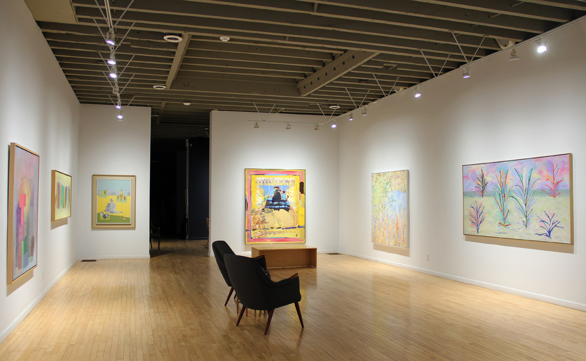
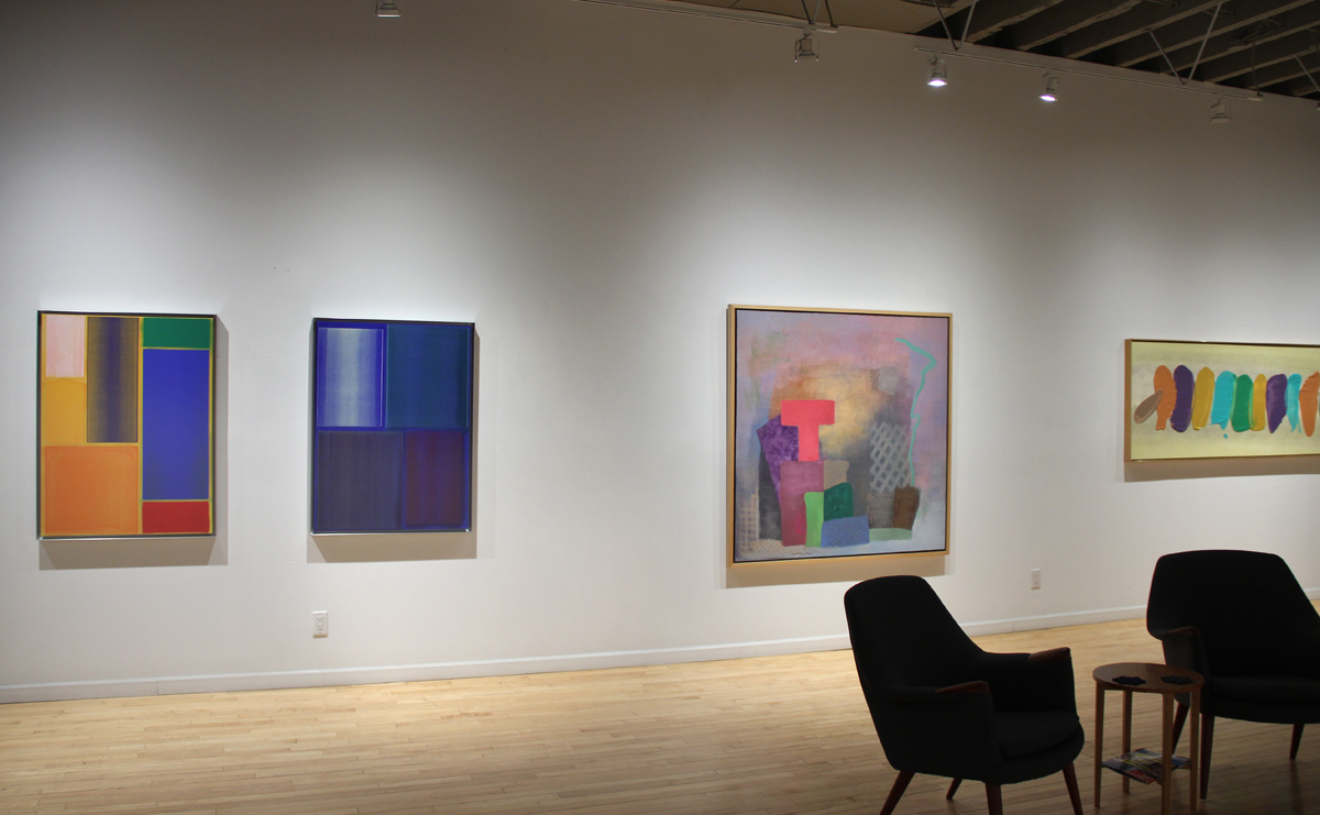
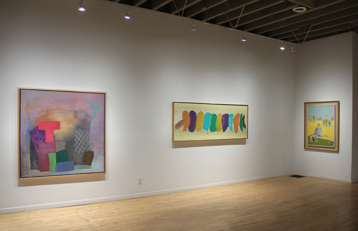
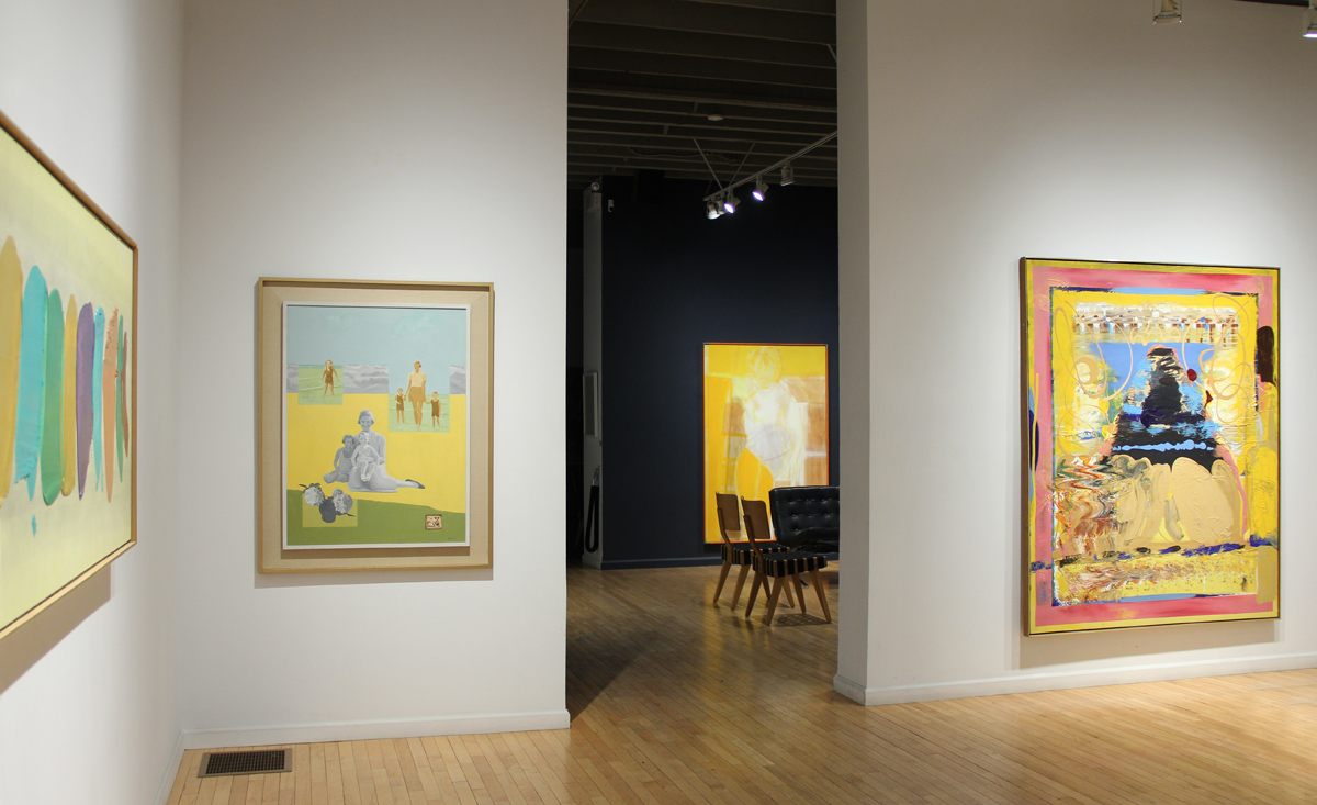
Gallery Installation View
"Chroma V"
Gallery Installation View
"Chroma V"
Jonathan Forrest “Good Day Sunshine”, 2022
"Chroma V"
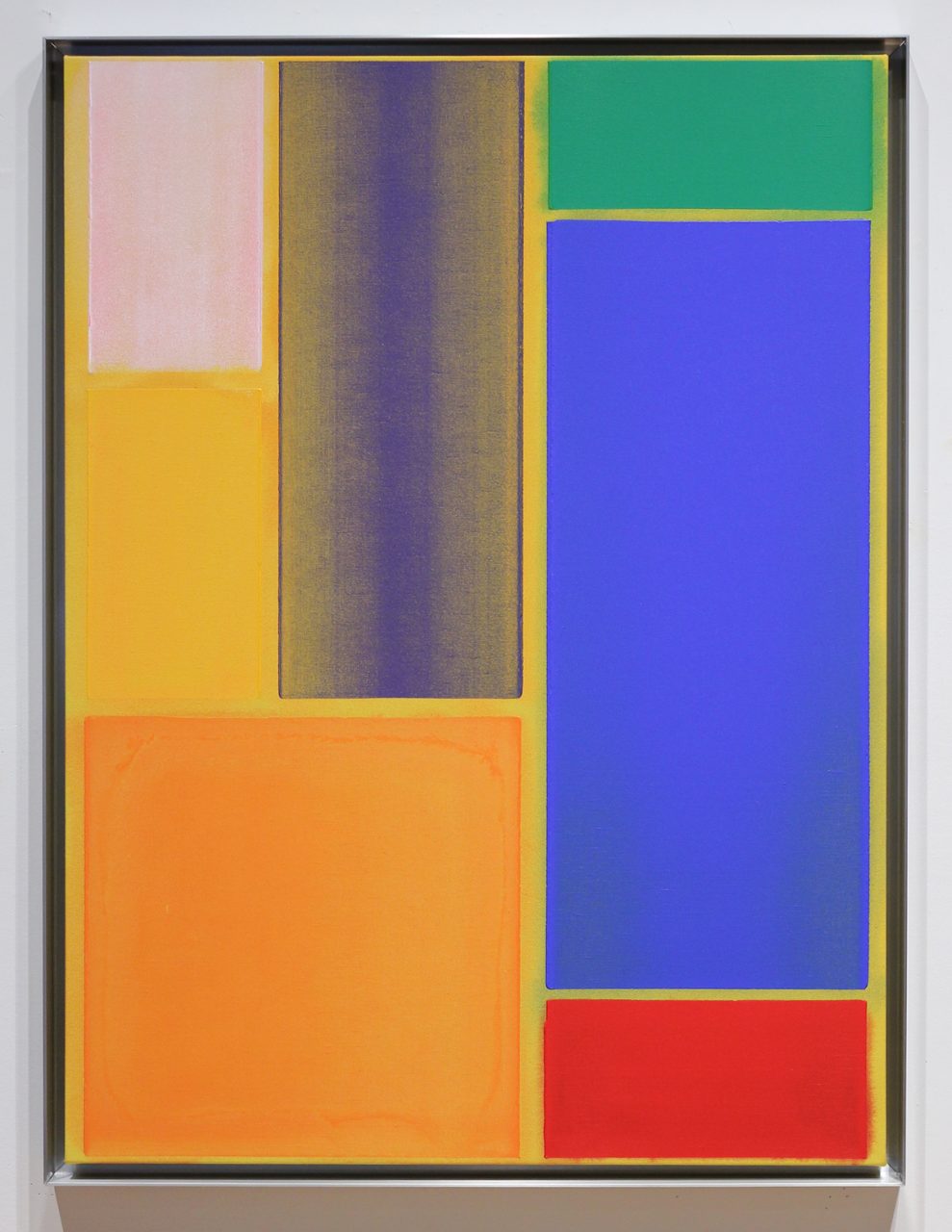
William Perehudoff “AC-83-049”, 1983
"Chroma V"
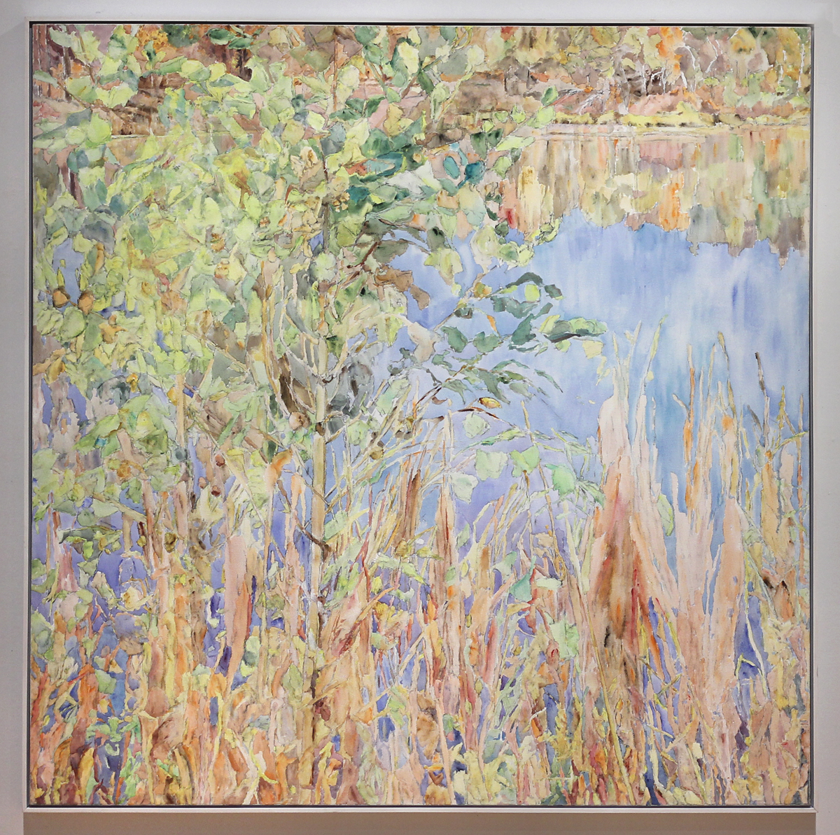
Dorothy Knowles “York Pond”, 1994
"Chroma V"
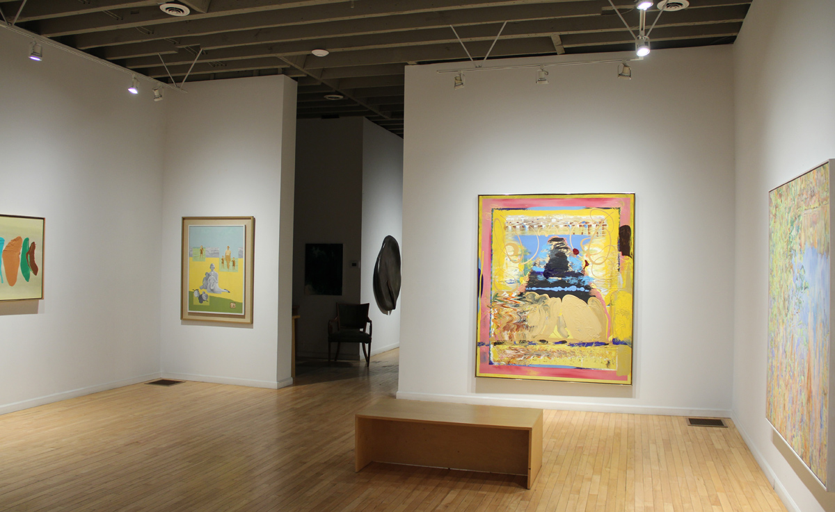
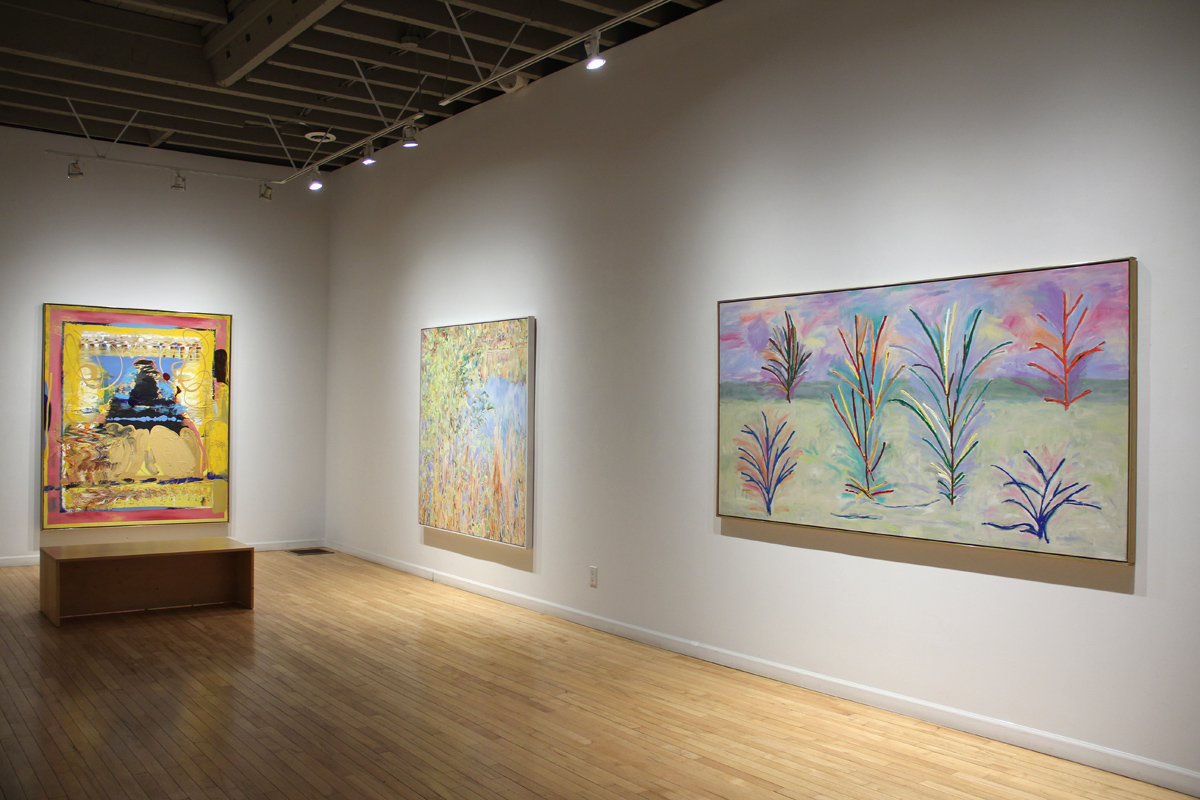
Gallery Installation View
"Chroma V"
Gallery Installation View
"Chroma V"
Jonathan Forrest “Evening Glimmer”, 2022
"Chroma V"
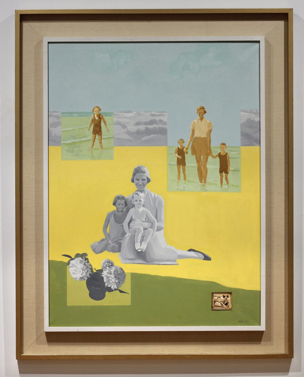
Paddy Gunn O’Brien “Maternal Sequence”, 1969
"Chroma V"
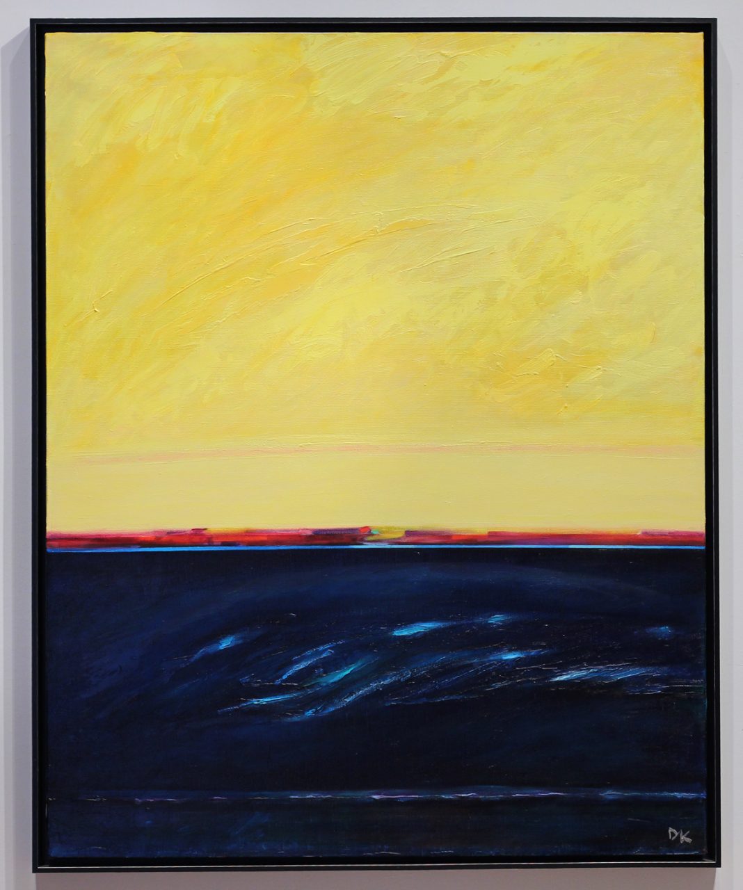
Duncan de Kergommeaux “Summer Days, Lake Huron”, 2008/9
"Chroma V"
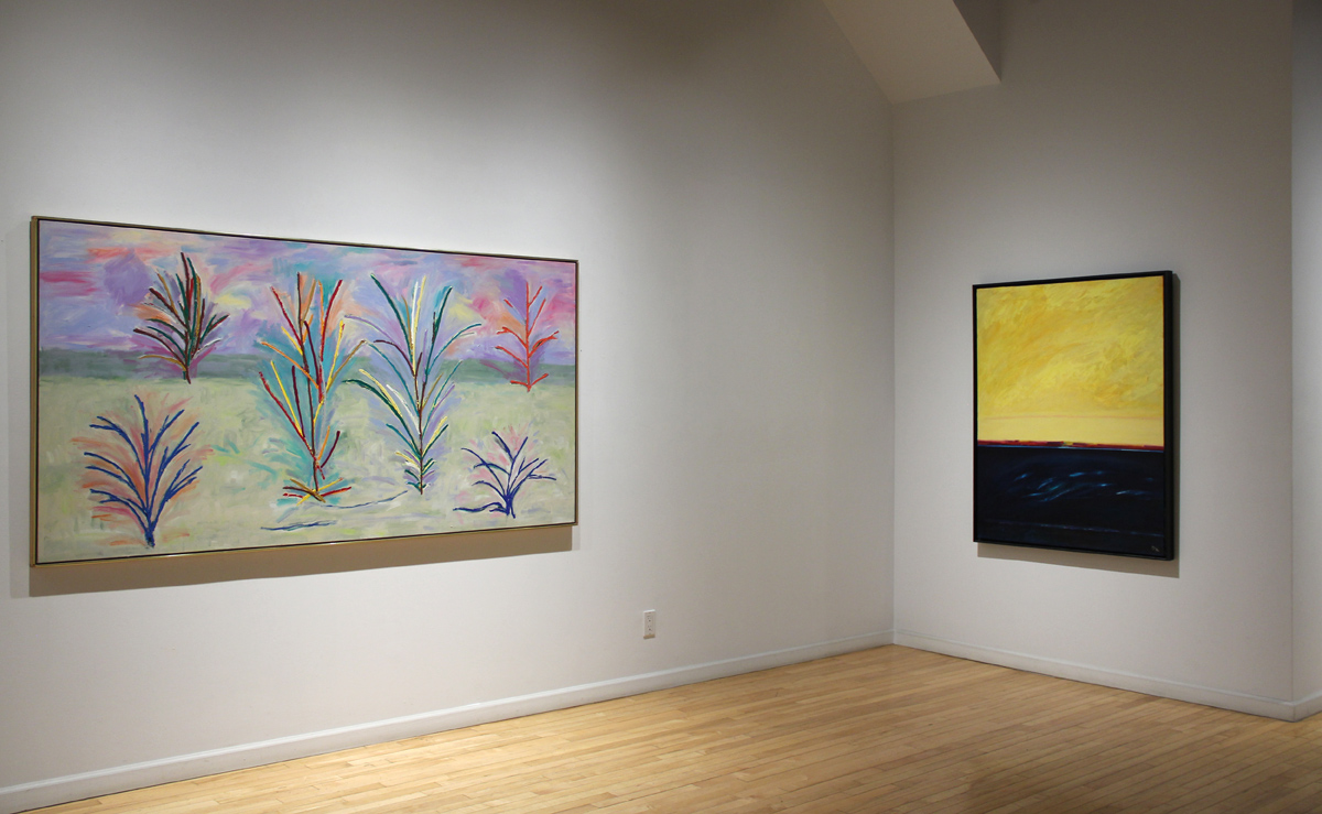
Gallery Installation View
"Chroma V"
Gallery Installation View
"Chroma CV"
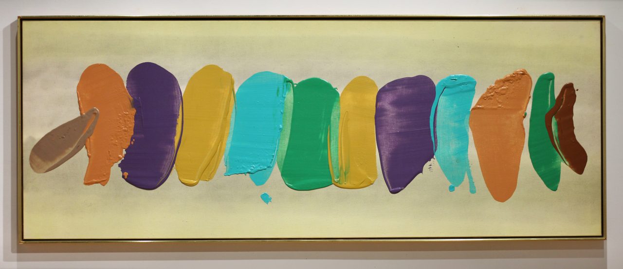
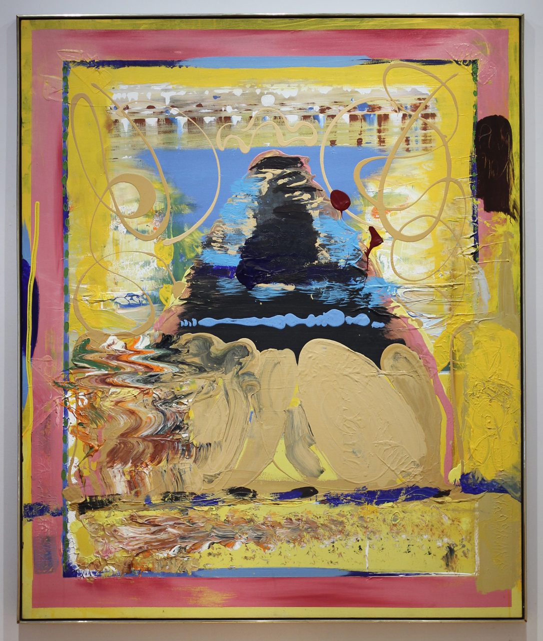
Robert Natkin “Untitled”, c. 1989
"Chroma V"
Gordon Rayner “The Queen”, 1977
"Chroma V"
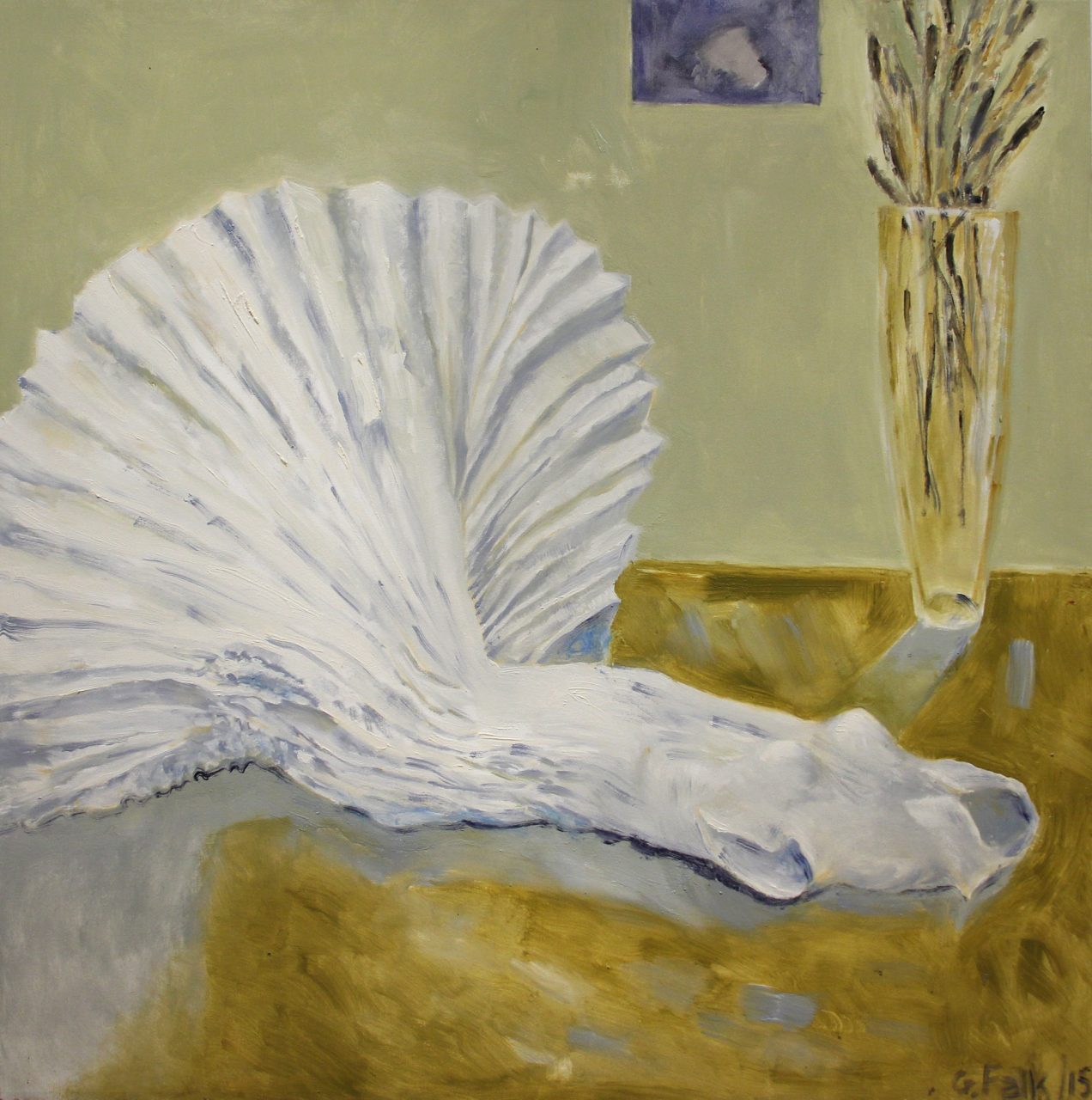
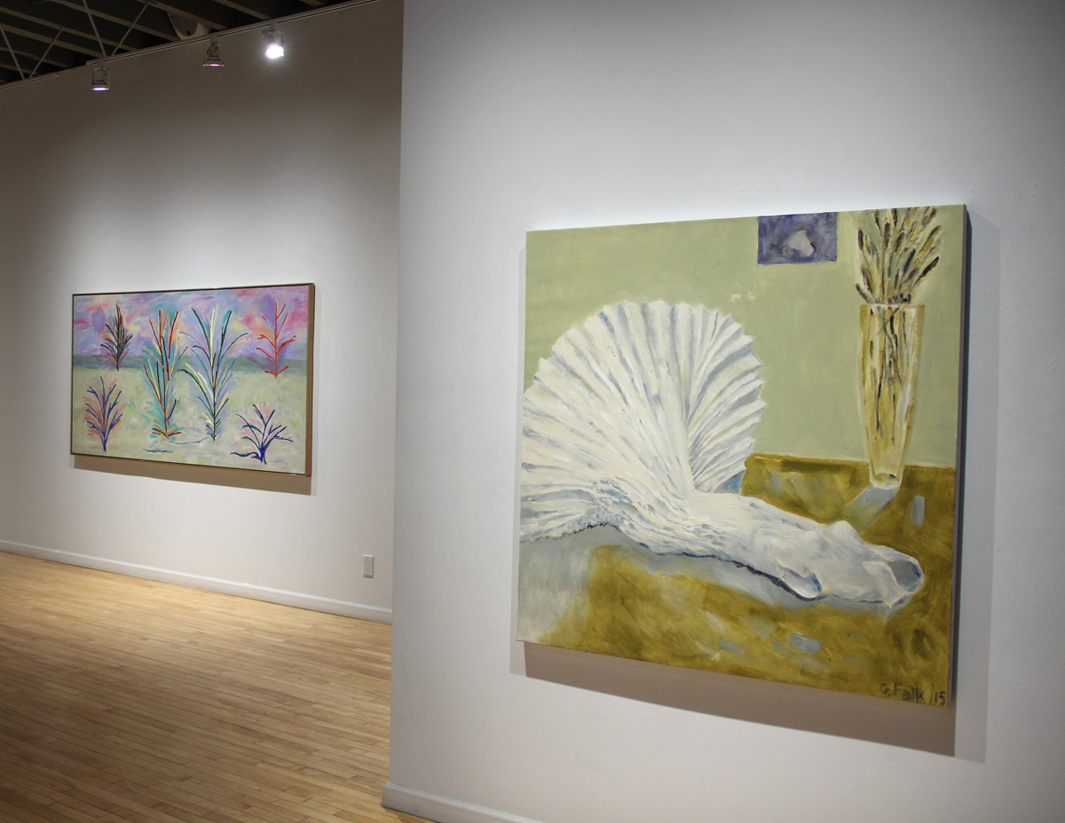
Gathie Falk “White Dress (Pleated Skirt)”, 2015
"Chroma V"
Gallery Installation View
"Chroma V"
Gallery Installation View
"Chroma V"
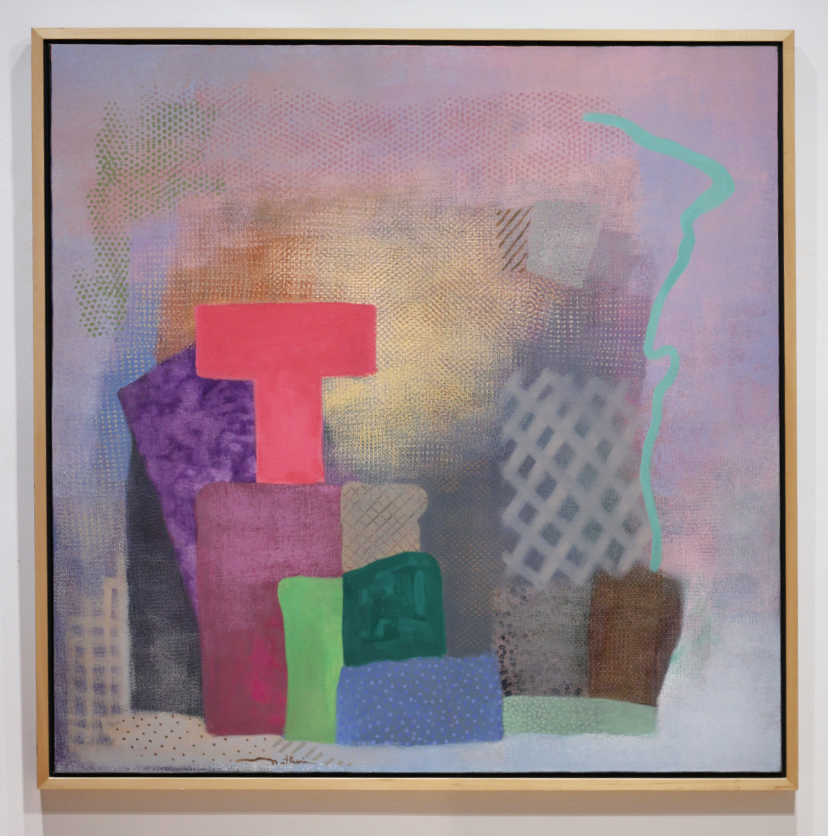
David Bolduc “Banzao”, 1986
"Chroma V"
Greg Curnoe “Remind Norma to Mail a Letter”, c. 1963
“Chroma V” March 4 – 25, 2023
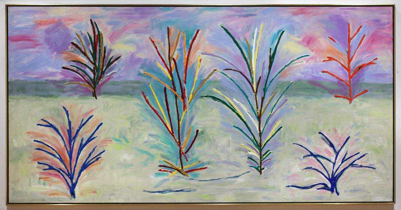
Every winter for the past 5 years we have curated an exhibition that celebrates colour. Continuing with the tradition, this year we have selected artworks that are saturated with glorious colour: dripped, swiped, stained, washed, or applied straight out of the tube. The exhibit combines new consignment paintings, unseen historical work as well as recent paintings by gallery artists.
Artists included: David Bolduc, Greg Curnoe, Duncan de Kergommeaux, Gathie Falk, Jonathan Forrest, Dorothy Knowles, Paddy Gunn O’Brien, Robert Natkin, William Perehudoff, Gordon Rayner.
Best known for his colourful abstract paintings that focused on linear images painted over a wide variety of textured coloured backgrounds, David Bolduc used unmixed colour straight from the tube to draw his controlled lines. This fresh canvas from a prominent Toronto collection, is a gem from 1986, a period in which Bolduc was thinking of both Matisse and colour-field paintings. It is both abstract and landscape, luscious and patterned. Bolduc stated “I’m interested in taking a nothing colour and giving it some bite to make it warmer. I’m not trying to be innovative. I’m trying to make an object you haven’t seen before. Colour is all I’m working with”.
Other landscapes in the exhibit are also not without jolts of colour. Dorothy Knowles‘ classic landscape painting “York Pond” is simply dazzling! It is an excellent representation of her work: light, airy and atmospheric, whereas, Duncan de Kergommeaux coveys the power of Lake Huron with a velvety rich dark blue in contrast to a lively yellow sky. Both artists approach their subject with very different treatments, each presenting their signature style on their local landscape.
The abstract paintings of both Jonathan Forrest and William Perehudoff are strongly connected. With glowing colour and subtle, nuanced grounds, William Perehudoff’s paintings have emotional resonance. Using a wide palette, Perehudoff was a master of communicating emotion through colour. The bright gel-like marks skip across the buttery yellow stained background in “AC-83-049”, both soothing us and charging us with energy. Similarly, Jonathan Forrest‘s paintings start with intensely saturated coloured backgrounds set off by blocks of paint and colour. “In the higher key pieces, the colour is what I’d call impact colour with each block hitting you full force. The deeper blue pieces take on a very particular light – the sort of light you get on an evening walk after the suns goes down where everything glows blue, and any whites light up.”
Gordon Rayner‘s “Queen” painting from 1977 combines bubble gum pink and bright yellow which makes a striking colour combination. Like Perehudoff, Rayner was greatly influenced by Clement Greenberg. “Once I began to understand Greenberg’s ideas, I started to like them much more….I wanted to investigate the philosophy of adjacent opposing colours, side by side and simple, and rid the canvas of the illusions of deep space and all that entails”. “Queen” does just that. Set within a pink and yellow painted frame, the assonate colours and strong mark-making combine in a riot of energy, unbound by any set rules.
Another rule breaker was Greg Curnoe and his early 1960s paintings on masonite. Newly arrived in London after departing from Toronto’s Ontario College of Art early, Curnoe set up a studio in downtown London and feverishly began making work. This painting “Remind Norma to Mail a Letter” was painted in his famous King Street studio, where, free from the constraints of his OCA teachers, Curnoe began making Dada-inspired assemblages of found objects, collages of bus transfers and large life-sized paintings of people on sheets of plywood. The paintings are loose, highly gestured, at times graphic, raw and of course intensely colourful. They reflect Curnoe’s interest in recording the people and events in his daily life as well as his fascination with the shape and curve of the female body.
For this year’s “Chroma” exhibition in particular, the colours associated with some of the artworks are not all “super-charged”. Robert Natkin‘s abstract from the late 1980s is visually complex, created by using cloths and netting as stencils, along with organic, free-flowing brushstrokes and carefully considered arrangements of shapes. Light, texture, pattern and emotive colour combine in this beautiful abstract from the 1980s.
Paddy Gunn O’Brien‘s painting “The Maternal Sequence – 3 Chrysanthemums on a Beach: The Maternal Sequence” from 1969 is similarly soft in its colouration. O’Brien created paintings that were strongly rooted in her local environment with a keen interest in the passage of time. They create a dream world, a fragmented moment in time enveloped in the softness of English colours.
Rounding out our exhibition is Gathie Falk‘s “White Dress (Pleated Skirt)” painting. Though not at all about colour, it is difficult not to include Falk’s work these days. The painting is a nod to Falk’s “Reclining Figure” bronze and papier-mache sculptures currently on exhibit at Museum London down the street. It is also a delightful treatment of Falk’s delicate use of shades of white, gold and light green colours. Poignant and subtle without the need for any vigorous colours.